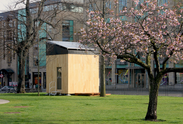
The Cube Project by Mike Page
Dr Mike Page gives us an interesting tour of his newest initiative titled The Cube Project. Basically it’s partnered with the University of Hertfordshire, who set out to build a compact home, no bigger than 3x3x3 metres on the inside. They wanted it so one person could live a comfortable, mode
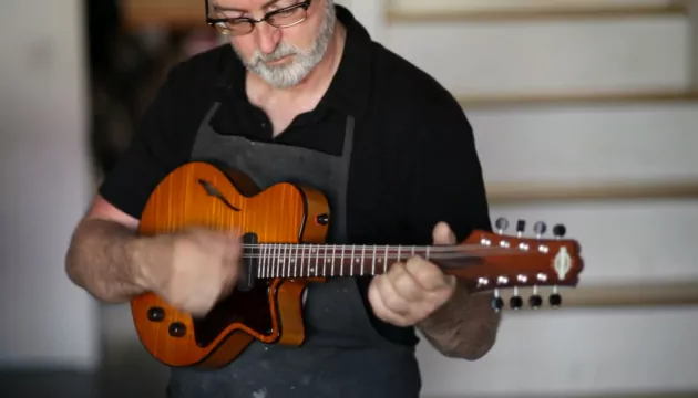
MEET YOUR MAKER by Asylum Artists
Meet your Maker is a fantastic new project by Asylum Artists, a production studio that handles lots of different digital work, for example filming, staging, and CG/Motion. This time round they film a piece that follows the journey of a hand built guitar with stringed instrument maker, Joe Yanuziello
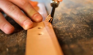
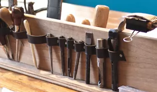
The Belt Project by Wood & Faulk
The Belt Project by Matt from Wood & Faulk has been an interesting project to follow, especially for all of the craft enthusiasts. His friend JD Hooge kindly documented the whole process and shows us just how skilled you have to be to make your own leather goods!

How to Sew a Spacesuit, Fashioning Apollo
I started reading an interesting excerpt this morning on technology site Gizmodo about a new book out by Nicholas de Monchaux titled Spacesuit: Fashioning Apollo. It’s a story about the Apollo Spacesuit, one of the most intricate garments ever assembled, a project nearly too difficult for even
Entermodal Bespoke Leather by Wood & Faulk
The Wood & Faulk website is becoming one of my top destinations to visit, most of the features on there are worth sharing and are very inspiring. This one highlights a leather worker named Larry Olmstead who owns a small goods label titled Entermodal. Larry has 17 years worth of experience in d
Paper Record Player From Kelli Anderson
Looking for something creative and inspiring to view over lunch?, this project from Kelli Anderson could be just the tonic to cure your predicament of break-time boredom. To be honest this short little video was just the pickup I needed earlier to get myself inspired and raring to get on with my day
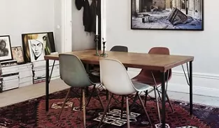
One Bedroom Studio Apartment in Stockholm, Sweden
If you wanted to buy a one bedroom apartment, this would be the one to snap up. A studio flat located in Stockholm where the interior really is of high caliber. The people who are selling this place must be photographers of some sort, see paraphernalia, and must also be big fans of design and [&hell
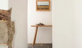
Another Country Contemporary Craft Furniture
Another Country is a furniture company that produces all of their products by hand in a small workshop in Dorset, England. Inspired by traditional Scandinavian and Japanese woodwork, they aim to make items that are truly functional and that will last the test of time. “We’ve taken familiar f
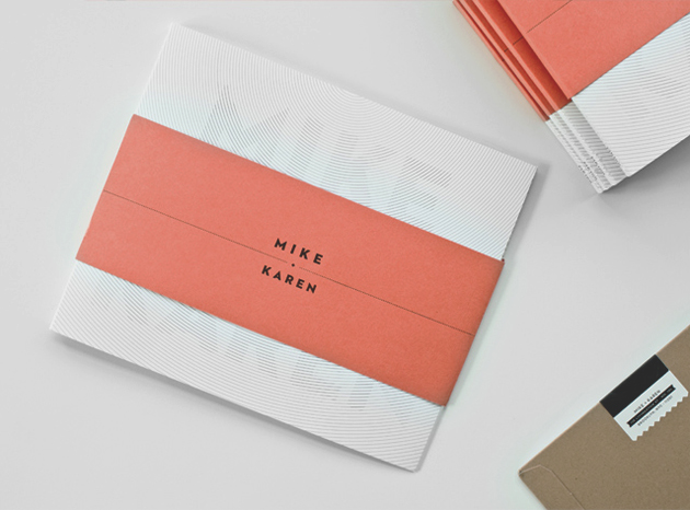
Donna Wearmouth for Quadra Gallery
Donna Wearmouth, a junior designer at Gardiner Richardson, created an interesting series of design work for Quadra Gallery. These minimalist pieces include an opening poster, various guides, and the identity, all with the same basic aesthetic. The use of type was something that originally caught my
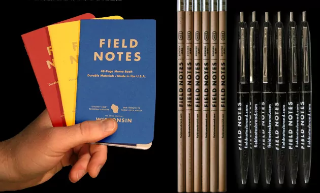
Interview with Jim Coudal of Field Notes
This little brand is highly regarded by many designers and is a product used all over the world. Field Notes, created by Draplin Design Company in conjunction with Coudal Partners, is inspired by the vanishing subgenre of agricultural memo books, ornate pocket ledgers and the simple, unassuming beau

Intel Visual Life Profile on Michael Wolff
m ss ng p eces recently created an Intel Visual Life profile of legendary creative advisor and designer Michael Wolff. This piece was only released last week, but further extends Intel’s look into creativity following a profile on The Sartorialist, aka Scott Schuman. Michael Wolff is recognise

Obsolescence is a Crime by Vitsoe
Vitsoe have been producing some nice videos on their vimeo page as of late, I picked out their newest one titled Obsolescence is a Crime. They discuss something that is known in the product world as ‘planned obsolescence’, products that are deliberately intended to have a limited useful