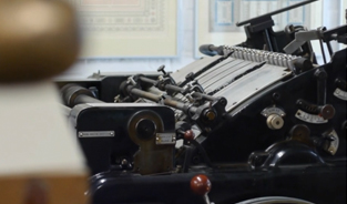
PureReversal by Build

This short by Build, a London-based graphic design studio, has been beautifully produced and crafted. I really enjoyed the pace of this film, you get a real sense of buildup. The whole point of this video, as seen below, is to celebrate the launch of a brand new bespoke typeface created by Dalton Maag for Nokia. They have been commissioning different design studios to do work that will highlight and promote this fact. The idea is not to not simply utilise the new typeface but be based on the same guiding design principles of classic Finnish design, where Nokia was founded.
“The design is all about functionality and purity of use. We have deliberately steered away from condensed proportions that necessitate large x-heights and dictate character shapes with a square appearance. Instead we focussed on more relaxed proportions that allow a softer appearance that benefit the the user’s reading experience, whether on screen or on paper. Every aspect and detail of the font’s design has been considered and weighed.”
“The spacing is kept generous to prevent characters merging together in the demanding environments of screen display and the fonts used on User Interfaces are fully hinted to always present the cleanest and purest pixel rendition of the characters.”
Watch on below.
www.wearebuild.com
www.daltonmaag.com

You may also like

Freunde von Freunden interview Ole Martin Hansen
With all eyes on London as the Olympic games progress it looks like Freunde von Freunden thought it
Short film on the influences of Steve Reich
It's pretty rare that I do this but the first film I came across today is the one I'm sharing with y

Short Film by Rolf Nylinder
I thought I'd throw a curve ball into the mix, as creative inspiration can come in many different sh