STUDIO NEWWORK: An Overview

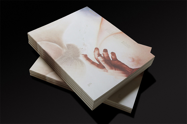
Being a recent graduate of a design college, I now have ample time to thoughtfully consider what drives me as an artist/designer/craftsman and how I want to practice design. The team at STUDIO NEWWORK understands their purpose, and their examples continue to inform my thoughts about how design should be executed. Ryotatsu Tanaka, Ryo Kumazaki and Hitomi Ishigaki, three graduates of the Fashion Institute of Technology, started the studio in 2007. The New York-based graphic design firm specializes in branding, print, and website design, and also produces NEWWORK MAGAZINE a bi-annual art publication featuring new ideas in art, design, high fashion, culture, and politics. Because many of their clients work within the fashion and beauty industry, showcasing their work without distraction is the primary concern.
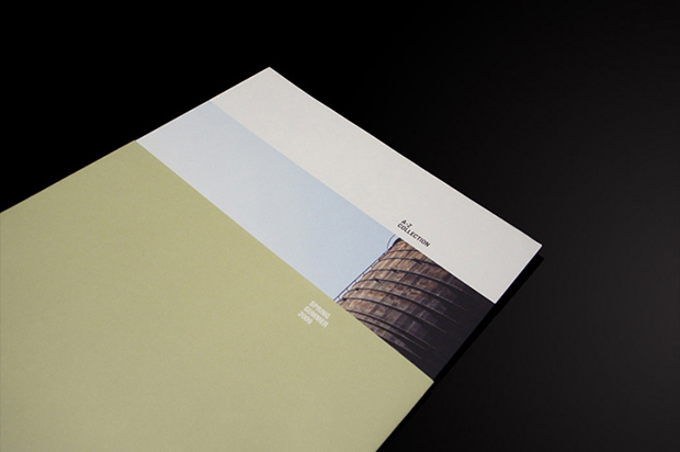
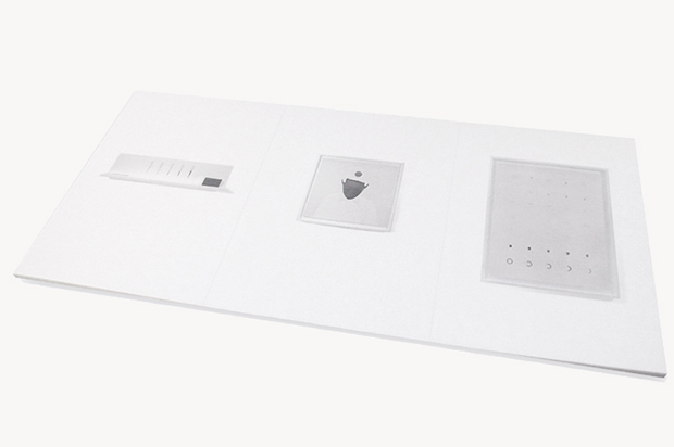
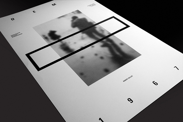
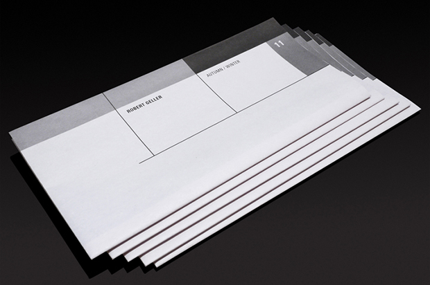
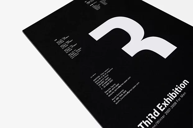
While browsing through their projects one gets the sense that their work is just “right.” The grid construction and logic employed reveals the amount of consideration, and thus time that goes into the production of the art. I admire the value they place on describing their process, a practice normally reserved for artists and craftsmen. Dedicating an entire page to how they design emphasizes the importance of theory in their work. The dynamic proportioning and underlying structure is balanced with warmth and humanist typefaces. This can be especially seen in their designs for Nail+Spa Sakura. A serif typeface and a warm palette within a minimal grid with no shortage of white space can only be described as “elegant.” Other work, such as the Robert Geller material is more Avant-garde, and the relationship to early Modernism (i.e., Suprematism) is clearly realized. Ultimately, STUDIO NEWWORK masters clarity through removal of unnecessary elements and inclusion of only essentials.
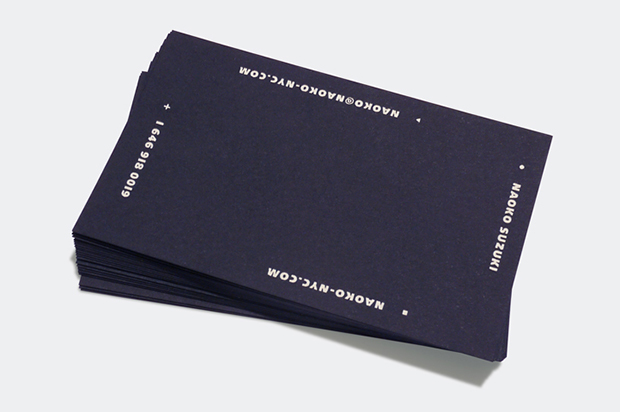
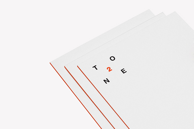
Personally, I am intrigued by their entire approach, including their website. They feature the work of their clients as a way to showcase their own work. One is able to see how their designs fit into the clients brand through viewing the work in context of how it will be consumed. Moreover, it is clear that STUDIO NEWWORK has a defined aesthetic, but even more interesting that their clients actively seek them for this. This is similar to how architectural firms operate, and it tends to be less common in the design consulting world. Perhaps it is because their work is architectonic in nature! Finally, I applaud their primarily print-based focus, which is mostly deemed “dying” by many firms. The stationary and professional materials are printed and finished using traditional techniques, such as letterpress and edge coloring, in non-traditional ways. The result stands out as distinct: careful restraint, boldness without sterility.
studionewwork.com
newworkmag.com
